Tag: Art

Art Class – Tech

For tech this week, we learnt what complimentary and analogous colours. We also learnt how to use watercolour. Complimentary colours are colours that make each other stand out, for example orange and blue, along with yellow and purple. Analogous colours are colours that go well with each other like yellow – green, yellow, and orange – yellow.

To practice our complimentary and analogous colour skills, we used watercolour to paint in a flower and a fish. We had to choose one for complimentary colours and another one for analogous colours.

I enjoyed this because I got to use my complimentary and analogous colour skills by using watercolour.
Duffy’s Hats

For this create task we research about birthday hats and choose which design is best. For my design I chose a crown which was the most popular because it was the easiest to make. There were a variety of colours like: green, red, blue, yellow, purple, etc. We also research some designs that goes well with Duffy’s Birthday topic. Some of the designs I added were: Duffy’s D on his hat, books, etc. These designs were most popular to be added to the hat because it went well with Duffy’s 30th Birthday theme. We all enjoyed making Duffy hats for Duffy’s Birthday because we all enjoyed making the hats, researching some designs about what to add for the Duffy hats.

I enjoyed this task myself because I enjoyed creating the designs so the hat can fit in the theme of Duffy’s 30th Birthday. I need to improve on measuring my head to make the right measurement for my head for the crown to fit on my head.

Duffy’s Boxes

For this create task we learnt about different designs like: cultural designs for the box and zentangles for the making of the box. We also learnt how to make a box for the making of Duffy’s box, which was created for putting our Duffy books inside the box, so it can be in a place where it will be easy to find and easy to grab. For the creation bit, we used pencils and markers to draw our cultural and zentangles designs on our box. We also created Duffy’s face and placed it on the box, so we know what’s inside the box, which would be the Duffy books. The purpose of the book was created to place the books inside the box because we investigated that many people inside our class would put the books inside their drawer or under the bed, so it won’t get in the way of playing their game or doing whatever they are doing. Our class just wants to give thanks to Duffy books at home for providing us with the books that they have given us for most of the years.

I enjoyed this art activity because I enjoyed learning about different cultural designs and zentangles. I also enjoyed this because it can help me as a Duffy kid to place my books in the right place instead of placing it in my drawer or under my bed. My favourite part of making these boxes is the finished product because I enjoyed showing off my design to the visitors that came and celebrated Duffy’s 30th year for Duffy books at home.

Art – Tivaevae Design


For this task, we made a culture art design that represents the Cook Island culture. For my flower, my design was a culture flower that represents the Cook Island culture. My flower had patterns like waves, mini flowers, and etc. There were colours like pink and white which represents bright colours. The leafs represents the nature of Cook Island because Cook Island has many flowers, leafs, trees, and etc. I enjoyed this task because I learnt many things about the Cook Island culture and what the patterns represents. The green represents the nature, the pink and white represents the bright colours.

One thing that I have to improve on is thinking about what else to add for the Tivaevae design. For example: more colours, designs that doesn’t just represents the nature.

Matariki Star Design

LI: to design a our own Matariki star

For this task we were able to create a Matariki star design. My design explains the four main elements of the earth. For example: the four main elements are: fire, water, earth, wind. The reason why I used the elements for my design is because I thought that the star would represent the earth and Tane Mahuta because Tane Mahuta represents the earth/land.

I enjoyed this task because I enjoy drawing or creating peaces of arts. I would like to improve on thinking about more ideas about the Matariki design.

Taniwha Names – Matheus

LI: to draw our name as a taniwha

For this task we made a Taniwha and wrote it as our name. For example: we drew a taniwha as one of our letters (my taniwha was my M). We wrote these names, so we could added it to our painting we made of ourselves. We drew a draft before we made our taniwha, so we didn’t have to think of a design.

I enjoyed this task because we put some creativty.

Taniwha Art Moka-Ika-Hikuwaru

LI: To learn about the traditional history of the Tamaki River.

Moka-Ika-Hikuwaru is a taniwha that lives within the panmure. This taniwha had eight tails. Our design of Moka-Ika-Hikuwaru is, he is doing a pukana, and the sun doing a pukana like in the story of Maui and the sun. The pattern on its face has little hearts on the eyes and the mouth. To shows it love. The little design on its body is a sympol of the water flowing left to right. The coloured of the background shows that the green is that the taniwha is on land and the blue is the sky.

I found this activity diffcult because I didn’t know how to draw a taniwha from my mind and we wasn’t allowed to trace the taniwhas design.

Worm Tunnel Art

LI: To make use of the whole space, To shade and blend colours, To use complementary colours.

In this activity we learn to make use of the whole space on the paper and to blend and shade using complementary colours. Complementary colours are colours that that are opposite one another on the colour wheel and when used next to each other stand out.

We found this activity creative because it had to use the whole space and the shading was challenging making it dark – mediem dark – light.

Art – Whale Tail

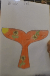
I created a whale tail art peice.

First I drew a digital whale tail. I used a sunset, birds, and flowers. I used this to represent things about a whale tail. The flowers means peace, sunset means that the whales will rasie like the sun, and the birds are apart of the sunset.

Next I coloured in my art and wrote about what the things I put in the whale tail. I wrote it so I can represent my whale tail. The colours I used was brown, yellow, green, orange, and black.

Lastly I used my digital whale tail to put it into a non digital whale tail. I practised how to shade my whale tail. I drew a whale tail because whales and dieing.

I enjoyed this task because I created a whale tail about something. I need to improve on making my design better. I did well on colouring in the whale tail.

ANZAC Quatrefoil

I created a Anzac Quatrefoil.

First I had to draw a quatrefoil about Anzac. Anzac stands for Australia New Zealand Army Corps.

Next I made stick mans that are standing. Some ideas are: soldiers saluting, a cross, a soldier shooting, and a poppy. We had to plan our colours, space, and our shpaes or symbols.

Lastly I created a quatrefoil that relates to anzac I used 2 men standing to respect and a grave. I used the salute to show the captain of the army.

I enjoyed this task because I didn’t know that Anzac stands for Australia New Zealand Army Corps. I need to improve on doing my print design rules because I didn’t put much space between them. I did well on thinking of some ideas because I know some things because about Anzac.